Summary
Let’s be direct on this one: School Website Design is largely an afterthought in the functional marketplace. So if you are a newcomer to the market, a well-organized, well-designed, functional website is a huge advantage. This results in higher enrolments and revenue. In this post, Jonathan does a great job of bringing these topics together in an actionable way. Most current school websites are a collection of what not to do; third party portals, disconnected logins, multiple logins, confusing navigation and clunky design. The 90’s are long passed and your students and their families deserve a better experience.
Private School Website Design: Best Practices
Your school website is often the first place families go when they want to learn about your district. It shapes how parents, students, and staff see your school before they ever step on campus. A sign that your site is severely lacking is when Facebook Groups become their source of school information. The goal is to keep your audience on your site.
The best school websites share a few key traits: clear navigation, a strong brand, fast load times, accessible design, and content that answers questions quickly. These sites make it easy for a parent to find lunch menus, calendars, and enrollment forms without digging through menus.
Below are examples of school and district websites that get these things right, along with the design choices behind them. Whether a team is planning a full redesign or making small updates, these examples show what works and why.
The Right CRM for Your School Is Really Important
A great website brings families to a school’s door. A CRM, or customer relationship management system, is what keeps the conversation going after they arrive.
Without one, inquiry forms pile up in an inbox. Staff lose track of who asked about tuition, who toured the campus, and who never got a reply.
What a school CRM handles:
- Tracking inquiries from the website contact form
- Storing family details in one shared place
- Sending follow-up emails automatically
- Managing applications and admissions steps
- Showing which marketing efforts bring in families
The connection between the website and the CRM matters just as much as the software itself. When the two systems talk to each other, a form submission becomes a record instantly. When they don’t, someone has to copy the information by hand.
Independent schools often feel this need first, since admissions teams work with each family directly. But district sites benefit too, especially for open enrollment and school choice programs.
| Feature | Why It Matters |
|---|---|
| Website form integration | No manual data entry |
| Email tools | Steady contact with families |
| Reporting | Shows what’s working |
| Mobile access | Staff can update records anywhere |
Schools should pick a CRM that fits their size and staff. A small independent school doesn’t need the same setup as a district with twenty campuses.
The best choice is usually the one the team will actually use every day.
Building Real Community and Communication Hub
A school website works best when families treat it as their first stop for information. That only happens when the site answers real questions quickly.
Features that turn a website into a hub:
| Feature | What it does |
|---|---|
| News feed | Shares updates without flooding inboxes |
| Event calendar | Lists games, concerts, and deadlines in one place |
| Portal login | Gives parents and students direct access to grades and forms |
| Alert bar | Posts closures and delays at the top of every page |
| Photo galleries | Shows daily life, not just posed portraits |
Districts often split content by audience. A simple menu labeled Families, Students, Staff, and Community helps each group find what it needs without guessing.
Consistency matters, too. When the website, the app, and email messages share the same colors, fonts, and voice, families recognize official communication right away.
Two-way communication builds trust. Contact forms, staff directories, and clear phone numbers tell visitors the school wants to hear from them. A directory that lists names, roles, and email addresses saves parents from calling the front office for every question.
Content needs owners. Many districts assign one person per department to post updates, which keeps pages current and spreads the work. Note that a department that abstains from posting gives the impression that the class is stagnant. Current content is crucial to a well-thought-out program in the digital space.
Stories carry weight here. A short post about a robotics team or a retiring teacher gives community members a reason to return, and it shows prospective families what the school values.
Responsive Design for Mobile
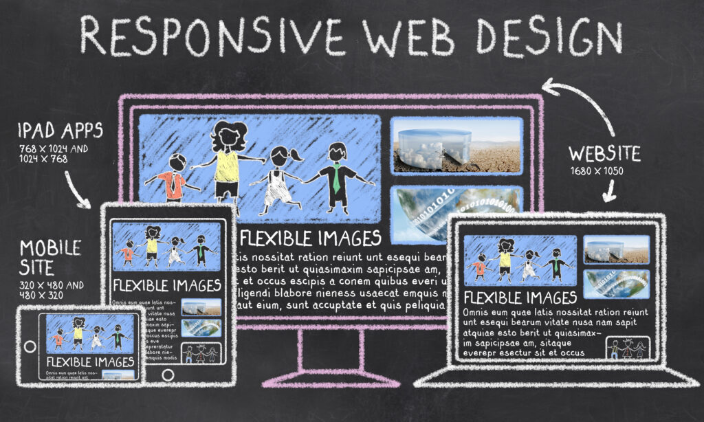
Most people who visit a school website are using a phone. Parents check lunch menus while waiting in the car line. Students look up sports schedules between classes. A site that only works well on a desktop screen misses a large part of its audience.
Responsive design means the layout shifts to fit the screen it appears on. Columns stack, menus collapse, and images resize automatically. While many site products are technically “responsive,” it is vital to inspect each design element to ensure its viewing ease in mobile.
What strong mobile design usually includes:
- Tap targets that are large enough for a thumb, with space between links
- Text that stays readable without zooming or pinching
- Navigation that opens with one tap and closes just as easily
- Images sized for smaller screens so pages load faster
- Forms with short fields and clear labels
Speed matters here more than on a desktop. Phones often run on slower connections, so heavy videos and large background animations can push load times up. Many schools scale back or remove animations on smaller screens for this reason.
Content order also changes on mobile. Designers often move the most requested items — calendars, contact details, and admissions or enrollment links — near the top of the page.
| Element | Desktop | Mobile |
|---|---|---|
| Navigation | Full horizontal menu | Collapsed menu icon |
| Layout | Two or three columns | Single stacked column |
| Hero media | Video or large image | Static image or smaller crop |
| Search | Visible search bar | Icon that expands |
Testing on real devices, not just a browser window resized by hand, gives a more accurate picture of how the site behaves. Don’t skimp here. Test on Android, iPhone, iPad, and Android tablets. Typically, schools readily have access to these things.
Easy-to-Use Navigation
Navigation is the map of a school website. When it works well, visitors find what they need in a few clicks. When it fails, they leave frustrated or call the front office.
Most school sites serve several audiences at once. Parents, students, staff, and prospective families all arrive with different goals.
A common solution is a main menu built around broad topics, paired with quick links for the tasks people repeat most.
Menu items that tend to work:
- About
- Academics
- Admissions
- Athletics & Activities
- Calendar
- Contact
Quick links people use often:
- Lunch menus
- Bell schedules
- Staff directory
- Parent portal login
- Bus routes
Keep the top menu short. Seven items or fewer is a reasonable target, since long lists are harder to scan and harder to tap on a phone.
Labels matter just as much as structure. “Enrollment” is clearer than “Get Started,” and internal terms like “Curriculum Council” mean little to a new family.
Drop-down menus should open quickly and stay open long enough to click. Menus that vanish when the cursor drifts create real problems for users with limited motor control.
A few habits that support easier browsing:
| Practice | Why it helps |
|---|---|
| Sticky header | The menu stays available while scrolling |
| Search bar | Gives visitors a backup path |
| Breadcrumbs | Shows where a page sits in the site |
| Keyboard access | Lets people navigate without a mouse |
District sites carry an extra layer, since visitors often need to reach a specific school. A clear school selector near the top of every page handles that request directly.
What Is Your School’s Real Identity
Before a single design choice is made, a school needs to know what it actually stands for. Colors, fonts, and photos come later. Identity comes first.
Many schools describe themselves with words that could apply to any school. “Excellence.” “Community.” “Tradition.” These words are safe, but they do not help families tell one school from another.
A real identity is specific. It shows up in the programs a school offers, the way teachers talk to students, and the reasons families chose it in the first place. Think back… “How did being a student make me feel?”, Then emulate that in your messaging and design.
Here are questions that help uncover it:
- What do parents say when they recommend the school to a friend?
- Which programs or traditions would students miss most if they disappeared?
- What kind of student thrives here, and what kind does not?
- What does the school do differently from the district or private school down the road?
- If the school could only keep one promise to families, what would it be?
Answers often come from people, not committees. Surveys, short interviews with parents, and conversations with students and staff tend to give more honest material than a mission statement written years ago.
Look for patterns. When the same three or four ideas appear again and again, a school has found its identity.
That identity then guides the website. It shapes which photos appear on the homepage, how the navigation is labeled, and which stories get told first.
Design without identity is decoration. Design built on identity gives visitors a reason to stay.
Why WordPress Is the Right Choice
Many schools pick WordPress as the base for their website. It powers a large share of the web, and that scale brings real benefits for school teams.
Cost and flexibility. WordPress is open source, so there are no license fees for the software itself. Schools pay for hosting, a theme, and any development help they need.
Easy content management. Staff members can add news posts, update a calendar, or swap out a photo without knowing code. Most people learn the editor in a single training session.
Room to grow. A district site can start small and add features later, such as:
- Staff directories with search filters
- Event calendars for each school
- Translation tools for multiple languages
- Forms for enrollment and volunteer sign-ups
Design freedom. Unlike closed platforms, WordPress does not lock a school into one look. Designers can build a custom theme that matches the district’s brand, including fonts, colors, and navigation patterns.
Accessibility support. Several themes and plugins are built with WCAG standards in mind. That helps schools meet legal requirements and serve families who use screen readers or keyboard navigation.
| Need | How WordPress Handles It |
|---|---|
| Frequent updates | Simple editor for non-technical staff |
| Multiple schools | Multisite setup under one dashboard |
| Custom branding | Full control over templates and styling |
| Security | Regular core updates and managed hosting options |
Schools should still plan for maintenance. Plugins and core files need updates, and someone has to own that task.
Frequently Asked Questions
School websites work best when they serve two audiences at once: families researching a school for the first time and current parents looking for a lunch menu or a bell schedule. The answers below cover navigation depth, accessibility rules, platform selection, and how brand elements like color and motion fit into a redesign.
What makes a school website design effective for prospective families and current students?
An effective design answers the questions each group asks within one or two clicks. Prospective families want tuition or attendance boundaries, academic programs, and a way to schedule a visit. Current students and parents want calendars, portals, and staff contact information.
Most schools handle this by keeping admissions content in the main navigation and pushing daily-use tools into a persistent utility bar at the top of the page. That separation keeps the homepage focused without hiding the links people use every week.
Speed matters as well. Large uncompressed photos and autoplay video files slow load times on phones, and a large share of school site traffic comes from mobile devices.
Clear photography of actual students, teachers, and buildings tends to perform better than stock imagery. Families are trying to picture their child in the space.
Which features should a district website include to improve communication and accessibility?
A district site carries more operational weight than a single school site. It usually needs to serve multiple campuses, a school board, human resources, and the community.
Common features include:
- A school directory with addresses, phone numbers, grade levels, and links to each campus site
- An alert bar for closures, delays, and emergencies that can be published in minutes
- A board section with agendas, minutes, and meeting recordings
- Employment listings linked to the applicant tracking system
- Translation support for the languages spoken in the district
- A calendar that filters by school and event type
Accessibility is a legal requirement for public districts, not an optional feature. The standard most districts follow is WCAG 2.1 Level AA, which covers color contrast, keyboard navigation, alt text on images, captions on video, and headings that follow a logical order.
PDFs deserve special attention. Board packets and enrollment forms are often scanned images, which screen readers cannot interpret. Publishing that content as HTML pages or tagged PDFs solves the problem.
What are the best examples of school websites and what design practices do they use?
Award programs from organizations such as Finalsite, Educational Web Awards, and the Web Marketing Association publish annual lists worth reviewing. The sites that appear on them tend to share a handful of practices rather than a single visual style.
They limit top-level navigation to roughly five to seven items. They use one strong homepage message instead of a rotating carousel with six competing slides.
They also treat news as a storytelling tool. Instead of listing every announcement, they feature a small number of student and faculty stories with real names and photos.
Many use a card layout for programs and departments, which adapts cleanly from desktop to phone. Consistent spacing and a limited type scale do more for the impression of quality than decorative elements.
How can a school redesign its homepage and navigation to create a stronger first impression?
A useful starting point is analytics. Reviewing the twenty most-visited pages from the past year shows what people actually want, which is often different from what the current menu emphasizes.
From there, schools can run a card sort with parents, students, and staff to test how they group content. This exercise frequently reveals that internal department names mean little to outside visitors.
Navigation labels should use plain words. “Admissions” works better than “Join Our Community,” and “Calendar” works better than “Happenings.”
On the homepage, the top section should state who the school is and where it is located, then offer one clear action such as scheduling a tour or starting an application. Below that, three or four sections can highlight academics, student life, and recent news.
Cutting page count is often part of the work. Many redesigns reduce a site from several hundred pages to a few dozen well-maintained ones.
What should schools consider when choosing a content management system such as Finalsite?
The evaluation should start with who will update the site. If department heads and coaches will post their own content, the editing interface needs to be simple enough for occasional users.
Key questions include:
- Integration — Does it connect to the student information system, email platform, and mobile app?
- Permissions — Can access be limited by page or section?
- Support and training — What is included after launch, and what costs extra?
- Accessibility tools — Does the editor flag missing alt text or contrast problems?
- Content migration — Who moves existing pages, and how many are included?
- Total cost — What are the annual licensing fees beyond the initial build?
Education-specific platforms like Finalsite, Blackboard, and Apptegy bundle calendars, alerts, and directories that general-purpose systems require plugins to replicate. General platforms offer more design flexibility and often lower licensing costs, but require more technical support internally.
Contract length is worth checking. Many education platform agreements run three to five years.
How can branding, typography, color, and animation improve a school website without harming usability?
Brand elements should support reading, not compete with it. A common approach uses two typefaces: one for headings and one for body text, with body copy set at 16 to 18 pixels.
School colors work well as accents on buttons, headings, and section backgrounds. Setting body text in a dark neutral rather than a saturated brand color keeps contrast ratios in the acceptable range.
Bold color choices are fine when contrast holds. A bright school gold on white often fails contrast tests, so pairing it with a dark background or reserving it for large graphics solves the issue.
Animation is most useful when it signals a change, such as a menu opening or content loading. Long scroll-triggered sequences delay access to information and can cause discomfort for users sensitive to motion.
Sites should respect the prefers-reduced-motion setting in browsers, which turns off animation for visitors who have requested it at the system level. That single addition covers most motion-related accessibility concerns.
Final Thoughts
A school website works best when it puts families first. Parents want quick answers, not a maze of menus.
The strongest school website designs share a few habits:
- Clear navigation with plain labels like “Admissions,” “Calendar,” and “Contact”
- A homepage that shows the school’s brand and points visitors to the pages they need most
- Accessibility built in from the start, not added later
- Mobile-friendly layouts, since most visitors arrive on phones
- Fresh content managed by staff who know the content management system
Design choices matter, but they should support the message. Bold colors, custom fonts, and light animation can help a school stand out. When those elements slow the page down or hide information, they work against the site.
First impressions form fast. A district website or independent school site often shapes how a family feels before they ever visit in person.
That is why a redesign should start with real questions:
| Question | Why it matters |
|---|---|
| Who visits most? | Shapes navigation and homepage layout |
| What do they look for? | Decides which links stay on top |
| Who updates the site? | Affects how simple the CMS must be |
| Does it meet accessibility standards? | Keeps content open to all users |
Teams that review analytics, gather feedback, and study showcase examples from Finalsite and other web design partners tend to make better choices.
Good school website design is not finished at launch. It grows as the school changes, and small updates keep the user experience steady over time.